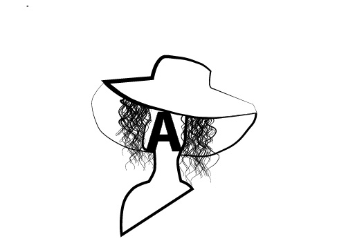
My logo is a silhouette of a woman that is wearing a very large hat with a bold “A” on the very front of her face. I decided to do this logo because not only did I want the logo to be represented by a woman, but I wanted her to be fashionable and have curls/ waves instead of just a silhouette or straight hair. I added just the “A” to keep the Logo simple so that the woman and hat don’t overbear each other. I used a google image (not copyrighted of course) as my inspiration to sketch out the silhouette of the woman. My original idea was a large “A” with a woman’s face inside, and a similar hat hanging on the edge of the A. I decided to not use that logo because I figured that it may not be as easily interpreted by the audience and perhaps it would be a better artwork piece rather than a logo. In Illustrator, I pretty much used the pen tool to trace out the full logo, but I struggled with tracing certain parts in order to merge the layers or place them either in front or behind each other. The hair was the hardest part since the spray tool was not giving me realistic and kinky curls that I wanted. I then decided to use the pen tool to create waves and use the “variable-width profile” to hopefully give dimension and depth for each wave. From there on I then decided to use the “variable-width profile” and heightened the stroke size to make the silhouette bolder in certain areas instead of the full body. I wanted my logo to express feminine aspects but also not overly glamorous so that the logo can be simple and easy to understand.
Silhouette inspiration: https://pixabay.com/illustrations/woman-hat-religious-fashion-lady-553429/
